Friday, 19 December 2014

Global Life Expectancy Up 6 Years Since 1990

Medical journal The Lancet has reported that life expectancy across the globe has increased by six years since 1990.

According to their snappily named report entitled Global, regional, and national age–sex specific all-cause and cause-specific mortality for 240 causes of death, 1990–2013: a systematic analysis for the Global Burden of Disease Study 2013 "Global life expectancy for both sexes increased from 65·3 years (UI 65·0–65·6) in 1990, to 71·5 years (UI 71·0–71·9) in 2013, while the number of deaths increased from 47·5 million (UI 46·8–48·2) to 54·9 million (UI 53·6–56·3) over the same interval."

For those of us who like clever people to read Lancet articles and just tell us the basics, the good folks at PopSci have summarised the report.  They conclude that the average girl born in 2012 can expect to live to the age of 72; the average boy to 68. People just about everywhere are living longer, and the average life expectancy has gone up by six years since 1990. In low income countries, the gains have been higher, with life expectancy up an average of nine years.

The highest life expectancies are in Iceland, Switzerland and Australia:

Source: PopSci
Some key stats from the report are shown here in a handy chart from the Wall Street Journal:
Source: Wall Street Journal
According to the World Health Organisation report “In high-income countries, much of the gain in life expectancy is due to success in tackling noncommunicable diseases,” says Dr Ties Boerma, Director of the Department of Health Statistics and Information Systems at WHO. “Fewer men and women are dying before they get to their 60th birthday from heart disease and stroke. Richer countries have become better at monitoring and managing high blood pressure for example.”


Thursday, 18 December 2014

Average Person in the UK Using 10% Less Electricity Than Five Years Ago

The rise of the electrically powered gadget is unstoppable.

You most likely have a 40 inch flat screen TV, maybe two. It might have games consoles, PVRs, cable or satellite boxes attached to it. Your smartphone(s) needs charging every day, you may even have a smart watch tethered to it that needs charging too. You may have laptops, desktop PCs, tablets and their associated broadband routers and NAS drives all blinking away 24 hours a day. Then there's white goods like fridges, dishwashers, washers, tumble dryers etc.

So you might think that the rate at which we are using electricity is increasing along with the number of electrical gadgets, but you'd be wrong. According to figures from the Energy Saving Trust published on the BBC News website this morning, the average person in the UK is in fact using 10% less electricity than five years ago:

The reason is that modern appliances are massively more efficient than their older counterparts. An LED backlit TV will consume much less electricity than an old CRT tube TV did. Energy saving light bulbs consume a fraction of what an incandescence bulb did. New fridges are often A++ or A+++ rated appliances for energy efficiency where old fridges were B or C rated.

This is an ongoing technology success story, and we should continue to seek efficiencies wherever we can to continue this trend.

Monday, 15 December 2014

Recession Comparison - 1930's versus 2014

There have been some alarming stories in the BBC News site about increasing reliance on food banks and The Guardian about a return to 1930's levels of poverty in Britain. But just how bad is modern poverty compared to pre-Welfare state poverty?

There was an excellent article in The Register today about comparing a modern recession to the great economic crash of the 1930's. Without wishing to diminish the anguish that any one individual family is going through having fallen on hard times, collectively the UK is vastly better off than it was back then.

GDP per capita in 1935 for the UK was $6,000 (inflation adjusted) whereas today it's $24,000, so we are a vastly richer country  as on average now. There's four times more (per person) to go around than there was back then. The Register article points out that Britain in 1935 was about as rich as Albania is today. 

Source: Social Democracy 21st Century Blog
Likewise, average wages were about £11,000 (inflation adjusted) in 1935 versus £24,000 today. The average income across the country back then was lower than the minimum wage is today!

For the unemployed, Public Assistance Committee handouts for a family of five (i.e, after eligibility for dole had run out) provided £2,750 a year, or just £53 a week (inflation adjusted) in the 1930s. For a family of five!

This isn't to detract from the hardships that individuals on their uppers are going through today, but relative poverty today's recession hit society doesn't have anything on the absolute poverty of yesteryear.

(Source: The Register)

Malaria Deaths Halved Since 2000

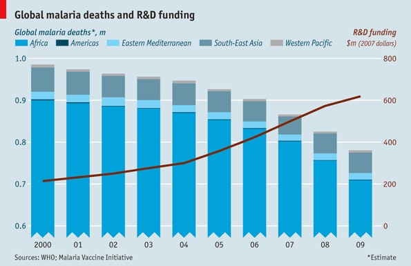
The BBC News site and The Economist have published figures showing that deaths from Malaria have dropped 54% since the year 2000. That means between 2001 and 2013, 4.3 million deaths were averted, 3.9 million of which were children under the age of five in sub-Saharan Africa.

Source: The Economist
This incredible change is due to the fact that up to 50% of people in malaria risk regions now have access to a mosquito net. There has also been a scaling up of diagnostic testing, and more people now are able to receive medicines to treat the parasitic infection.

In 2013 Azerbaijan and Sri Lanka reported zero cases for the first time ever and 11 others continued to maintain zero cases.

Friday, 12 December 2014

The History of Land Speed Records

If you want an incredible story of progress that keeps on getting more incredible, then the land speed record is a very visible symbol of humanity's capacity for ingenuity.

Up until the steam locomotives of the early 19th century, it was thought that travelling at heady speeds like the break-neck 25 mph that the likes of Stephenson's Rocket was capable of would most probably kill the occupants. Humanity had never travelled faster than the speeds that a horse could gallop.

The history of land speed records in motor vehicles starts in 1898 at a blistering 39.24 mph in an electrically powered wheel-driven vehicle. By the early 1960's, wheel driven cars had topped out at about 400 mph and were overtaken by jet and rocket powered successors. Since then we have nearly doubled the land speed record, adding over 350 mph.

Source: Figures from Wikipedia
The current record is a giddying 763.04 mph, set in 1997. But that's not the end of things, not by a long shot.

A British team is assembling and testing Bloodhound SSC which is aiming to top 1,000 mph. That would be over 25 times the speed at which Gaston de Chasseloup-Laubat travelled in 1898, a feat achieved in just 117 years.

Source: Wikipedia

Thursday, 11 December 2014

Man-Made Objects - Distance Travelled

For tens of thousands of years man-made objects like boats had only travelled a few hundred miles between nearby islands. Then Marco Polo's epic voyages of the 13th Century clocked up 15,000 miles (24,000 km). The circumferance of the earth is only 40,000 km so there's really not much further you can go if you stick to the earth's surface. Columbus's voyages, for example were only a few thousand miles in length between Spain and the Americas..

In 1957 the Soviets launched the Sputnik satellite, which made it 223,000 km into orbit. In 1969 the USA managed to land a man on the moon at 395,101 km from earth, and then return to earth (so therefore approximately 800,000 km).

But these distances are absolutely dwarfed by the number of kilometres travelled later solar system probes:

Source: Figures from Space Alliance Forum
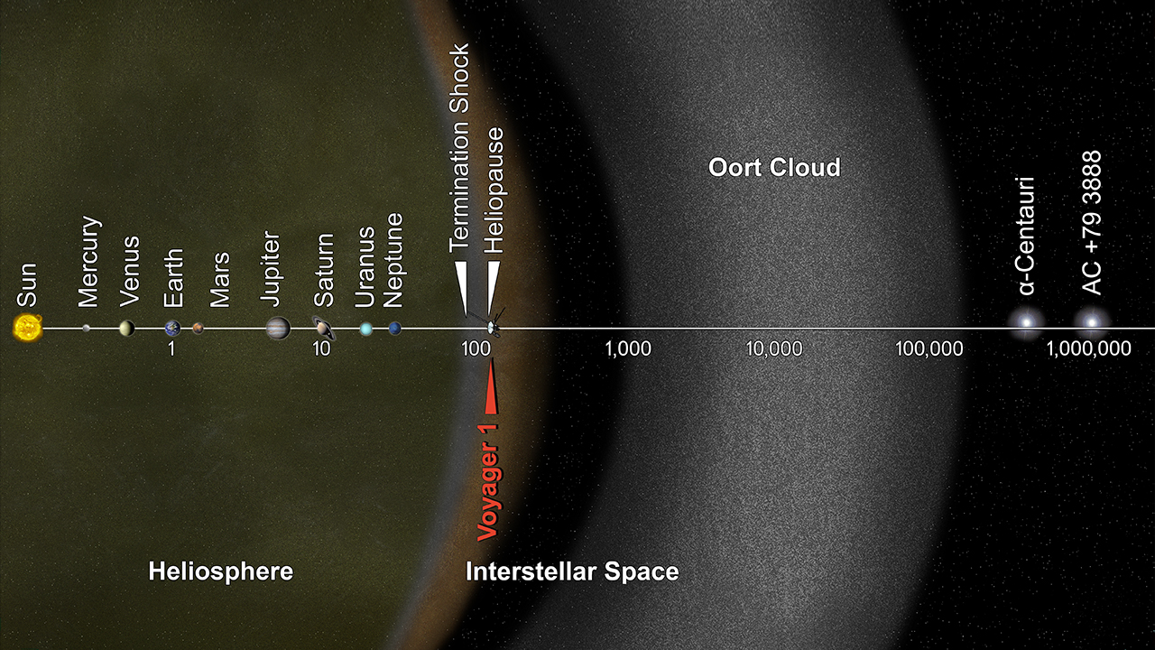
The record on the right there is for the Voyager 1 probe which has now travelled 17,413,166,489 km since its launch in 1977. It has since travelled 116 times the distance between the Earth and the Sun and exited the solar system altogether, and is still going off into interstellar space.

Source: NASA
It took this photo of the distant pale blue dot that is the Earth on its way out before losing contact with us altogether. Even travelling at speeds of over 35,000 miles per hour, it would take Voyager 1 nearly 80,000 years to travel the distance to the nearest star, Proxima Centauri.

It's actually a bit of a cheat to say this is something that is getting better than it used to be, due to the length of time it takes to travel these incredible distances. This means that some of the older probes launched in the 1970s hold the record for the longest distances travelled, but as Voyager 1 is still going at 17,043 metres per second it's still an ongoing record.

Here's the distances travelled by year of launch, with the 1969 moon landings in there for scale:

Source: Figures from Space Alliance Forum
To put this in context, the 20th Century Voyager 1 has travelled 1,160,878 times as far as Marco polo's 13th century boat ever did.

Wednesday, 10 December 2014

UK Agricultural Output Nearly 50% Higher than in 1973

According to statistics released by the Department for Environment, Food & Rural Affairs (DEFRA) in November 2014 the UK's agricultural productivity is on an upward trend:

Source: DEFRA stats
The figures are a measure of total output (cereals, industrial crops, forage plants, vegetables, potatoes, fruit, livestock meat, other livestock products like milk and eggs etc.) divided by the total amount of resources to produce them (labour, energy, animal feed etc.),

The result is that 2013 productivity is 47% higher than it was in 1973.